# vuejs-tree
**Repository Path**: mirrors_singod/vuejs-tree
## Basic Information
- **Project Name**: vuejs-tree
- **Description**: A highly customizable and blazing fast Vue tree component ⚡🌲
- **Primary Language**: Unknown
- **License**: MIT
- **Default Branch**: master
- **Homepage**: None
- **GVP Project**: No
## Statistics
- **Stars**: 0
- **Forks**: 0
- **Created**: 2020-09-25
- **Last Updated**: 2026-03-22
## Categories & Tags
**Categories**: Uncategorized
**Tags**: None
## README
VueJS Tree
==========
[](https://www.npmjs.com/package/vuejs-tree)
A highly customizable vuejs tree viewer
## Getting Started
### Install
You can install using yarn:
```bash
$ yarn add vuejs-tree
```
or with npm:
```bash
$ npm install vuejs-tree
```
### Usage
Add the following lines at the top of your .js file which contains your Vue instance.
```javascript
import Tree from 'vuejs-tree'
// in your vue instance
components: {
'Tree': Tree
},
methods: {
getTree: function(treeId) {
for (let i = 0; i < this.$children.length; i++) {
if (this.$children[i].$props.id == treeId) return this.$children[i]
}
}
}
```
Then add the following line in your html file to generate a tree. You can have as many trees per page as you want.
```html
```
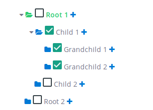
## Data Structure
You need to define data to display which is a nested array of hash.
Example:
```javascript
data: {
treeDisplayData: [
{
text: 'Root 1',
nodes: [
{
text: 'Child 1',
nodes: [
{
text: 'Grandchild 1'
},
{
text: 'Grandchild 2'
}
]
},
{
text: 'Child 2'
}
]
},
{
text: 'Root 2'
}
]
}
```
### Node properties
Here is a fully customized node:
```javascript
{
id: 1,
text: 'Root 1',
definition: 'First node',
depth: 1,
checkable: false,
selectable: false,
expandable: true,
disabled: false,
tags: [42],
state: {
checked: false,
expanded: false,
selected: false
},
nodes: [
{},
...
]
}
```
The Following properties define a node level css and behavior.
| key | type | Detail |
|------------------|--------------------------------------------|-----------------------------------------------------------------------------------------------------------------------------------------------|
| id | String or Integer --> Mandatory | Used in the tree to differentiate each node |
| text | String --> Mandatory | The text value displayed at the right of the node icons |
| definition | String --> Optional | If some text is given, then it will show as a tooltip |
| depth | Integer --> Optional | It corresponds to the node depth, starting from 0, 1 or anything. It's advisable to fill these fields if some of your nodes have the same id |
| disabled | Boolean --> Optional, default: false | Used to specify if the node is disabled or not |
| tags | [Integer] --> Optional | The tag is displayed at the right end of the line |
| checkable | Boolean --> Optional, default: true | Used to enable or disable the node's check event |
| selectable | Boolean --> Optional, default: true | Used to enable or disable the node's select event |
| expandable | Boolean --> Optional, default: true | Used to enable or disable the node's expand event |
| state | | nodes's state |
| state.checkable | Boolean --> Optional, default: true | Another way to enable or disable the check event |
| state.selectable | Boolean --> Optional, default: true | Another way to enable or disable the select event |
| state.expandable | Boolean --> Optional, default: true | Another way to enable or disable the expand event |
| nodes | Object --> Optional | Used to display the node's children. *Look above for a structure example* |
## Options / Styles
Here is an example of a customOptions hash the tree can take.
I suggest you to use a vuejs computed function if you want to use a function pointer.
```javascript
computed: {
myCustomStyles() {
return {
tree: {
height: 'auto',
maxHeight: '300px',
overflowY: 'visible',
display: 'inline-block'
},
row: {
width: '500px',
cursor: 'pointer',
child: {
height: '35px'
}
},
addNode: {
class: 'custom_class',
style: {
color: '#007AD5'
}
},
editNode: {
class: 'custom_class',
style: {
color: '#007AD5'
}
},
deleteNode: {
class: 'custom_class',
style: {
color: '#EE5F5B'
}
},
selectIcon: {
class: 'custom_class',
style: {
color: '#007AD5'
},
active: {
class: 'custom_class',
style: {
color: '#2ECC71'
}
}
},
text: {
style: {},
active: {
style: {
'font-weight': 'bold',
color: '#2ECC71'
}
}
}
};
},
myCustomOptions() {
return {
treeEvents: {
expanded: {
state: true,
fn: null,
},
collapsed: {
state: false,
fn: null,
},
selected: {
state: false,
fn: null,
},
checked: {
state: true,
fn: this.myCheckedFunction,
}
},
events: {
expanded: {
state: true,
fn: null,
},
selected: {
state: false,
fn: null,
},
checked: {
state: false,
fn: null,
},
editableName: {
state: false,
fn: null,
calledEvent: null,
}
},
addNode: { state: false, fn: null, appearOnHover: false },
editNode: { state: true, fn: null, appearOnHover: true },
deleteNode: { state: true, fn: null, appearOnHover: true },
showTags: true,
};
}
},
```
#### Styles
| Option name | Detail |
|-------------|----------------------------------------------------------------------------------------------------|
| icon | String - node folder icon |
| tree | Object - override default tree css |
| row | Object - override default tree node css |
| row.child | Object - override style of `` into the `
` row (e.g. you can manage the height of the row) |
| expanded | Object - contains the class of the expanded icon |
| addNode | Object - contains the class and the style of the addNode button |
| editNode | Object - contains the class and the style of the editNode button |
| deleteNode | Object - contains the class and the style of the deleteNode button |
| selectIcon | Object - contains the class and the style for the select node icon |
| text | Object - contains the class and the style for the node's text |
#### Options
##### Tree options
| Option name | Detail |
|----------------------|--------------------------------------------------------------------------------------------------------------------------|
| treeEvents | Object - contains the callback tree events, called **after** the tree row events |
| treeEvents.expanded | Object - enable or disable the callback when a node is expanded. If enabled, **fn** (function pointer) must be present. |
| treeEvents.collapsed | Object - enable or disable the callback when a node is collasped. If enabled, **fn** (function pointer) must be present. |
| treeEvents.selected | Object - enable or disable the callback when a node is selected. If enabled, **fn** (function pointer) must be present. |
| treeEvents.checked | Object - enable or disable the callback when a node is checked. If enabled, **fn** (function pointer) must be present. |
##### Row Options
| Option name | Detail |
|---------------------|---------------------------------------------------------------------------------------------------------------------------------------------------------------------------------------------------------------------------|
| showTags | Boolean - Show the node's tag if given |
| addNode | Object - enable or disable the add node button. If enabled, **fn** must be present. If *appearOnHover* is true, the button will appear only if the row is hovered |
| editNode | Object - enable or disable the edit node button. If enabled, **fn** must be present. If *appearOnHover* is true, the button will appear only if the row is hovered |
| deleteNode | Object - enable or disable the delete node button. If enabled, **fn** must be present. If *appearOnHover* is true, the button will appear only if the row is hovered |
| events | Object - contains the node events, **override** the tree row events behavior |
| events.expanded | Object - enable or disable the expanded node event. The **fn** key is optional, if present, it will **replace** the native behavior |
| events.selected | Object - enable or disable the selected node event. The **fn** key is optional, if present, it will **replace** the native behavior |
| events.checked | Object - enable or disable the checked node event. The **fn** key is optional, if present, it will **replace** the native behavior |
| events.editableName | Object - enable or disable the event when the node's name is clicked. If enabled, the key **fn** or **calledEvent** must be present. **calledEvent** is a string and it value must be an existing event (e.g. 'selected') |
## Events
### Tree
You can call your own function here by assigning a function pointer in the tree options and changing its state to true.
These functions are called after all tree modifications.
#### onNodeSelected
Called when a node is selected.
`myCustomOptions.treeEvents.selected.fn`
#### onNodeExpanded
Called when a node is expanded.
`myCustomOptions.treeEvents.expanded.fn`
Or called when a node is collapsed.
`myCustomOptions.treeEvents.collapsed.fn`
#### onNodeChecked
Called when a node is collapsed.
`myCustomOptions.treeEvents.checked.fn`
### Tree row
You can call your own function here by assigning a function pointer in the tree options. It will replace the existing behavior of the tree for this event.
You can also disabled an event by changing it's state to false.
#### toggleSelected
Called when a node is selected. `myCustomOptions.events.selected.fn`
#### toggleExpanded
Called when a node is expanded or collapsed. `myCustomOptions.events.expanded.fn`
#### toggleChecked
Called when a node is checked. `myCustomOptions.events.checked.fn`
#### editableName
You can call a special function if you assign it's pointer in `myCustomOptions.events.editableName.fn`
Or you can call an existing event by assigining it's name in `myCustomOptions.events.editableName.calledEvent`
example : `myCustomOptions.events.editableName.calledEvent = 'selected'`
## Methods
Methods Params:
`depth` --> Optional but help distinguish nodes with the same id.
`argWanted` --> It can either be a node attribute name (string) or a array of node attribute name (like ['id', 'name']).
`format` --> If you want the function to return an plain array (false) or a hash tree (true).
`maxDepth` --> The function will only access nodes within the maxDepth.
`fullNode` --> Return only node ids or node objects.
`conditions` --> It's used to affect only the nodes which match it. For example if the condition is {checked: true}, the function will affect only the nodes which are checked. You can use all nodes attribute that are present in the node object.
| Function | Detail |
|----------------------------------------------------------|----------------------------------------------------------------------|
| checkNode(nodeId, depth) | Check a node |
| uncheckNode(nodeId, depth) | Uncheck a node |
| getSelectedNode() | Return the selected node if you have selected a node |
| getCheckedNodes(argWanted, format = false) | Return all checked nodes |
| getExpandedNodes(argWanted, format = false) | Return all expanded nodes |
| checkAllNodes() | Check all nodes |
| uncheckAllNodes() | Uncheck all nodes |
| expandNode(nodeId, depth) | Expand a node |
| collapseNode(nodeId, depth) | Collapse a node |
| selectNode(nodeId, depth) | Select a node and deselect the previously selected node if it exists |
| expandAllNodes() | Expand all nodes |
| collapseAllNodes() | Collapse all nodes |
| deselectAllNodes() | Deselect all nodes |
| findNode(nodeId, maxDepth = 9999) | Find and return a node |
| getVisibleNodes(fullNode = false) | Get all visible nodes |
| getNodesData(argWanted, conditions = {}, format = false) | Customizable function that returns nodes |
### Get the tree instance
If you want to call any tree method, you need to get the instance.
For that you just need to call the `getTree` function and provide your tree `id`.